HubSpot Tips & Tricks: 5 Compelling Reasons To Use Sequences
HubSpot has evolved to become an Enterprise level Growth Platform with a ton of features and functionality. In turn, It can be difficult to identify...
3 min read
 Craig Cook
:
Feb 28, 2018 8:28:00 AM

If your company is using HubSpot CRM for Sales and Marketing, chances are your portal contains a lot of custom fields that are important to your business. If you have added all of those fields to the "About" section for Contact, Company and Deal records, (or your administrator has added the fields by default) those page views can get quite overwhelming.
 And it's so easy, you'll kick yourself for never having taken advantage of it before...
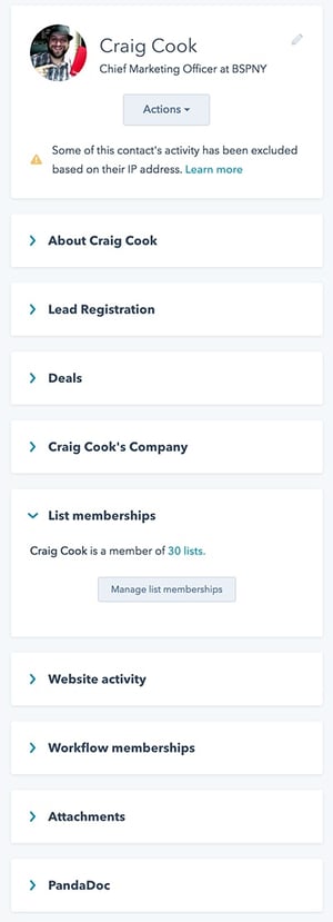
First, let's take a look at all of the items we have on the left side of a sample Contact record. It can get overwhelming pretty quickly, as evidenced by the image of my contact record in BSP's own HubSpot deployment. Just look at how much information is stuffed into that sidebar...
We have gotten all the way to the end of this list, and there is just so much more to go on the left sidebar...
So what are we to do when all of these fields are getting in the way, and we want to concentrate our efforts on specific information on the Contact record?
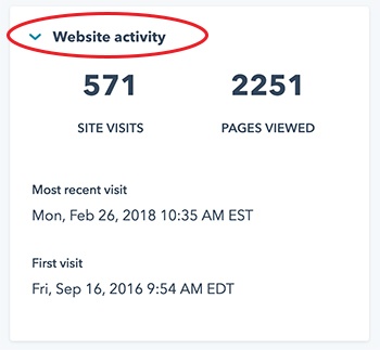
This simple little icon located at the top left of every module is actually a button! Use it to collapse any unwanted modules so that they only take up a bit of your screen real-estate.
Clicking On The Caret Icon Transforms This:

Into This:

Notice that the Caret symbol ^ is now an Angle Bracket >
With this trick, you can consolidate the entire left sidebar, except for the module that you are actively working with, to eliminate the clutter and streamline your HubSpot Workflows. Let's take a look at an example below:
 Clean & Uncluttered
This much more streamlined sidebar is easy to navigate, and now I can concentrate my efforts on the task at hand - managing the list memberships for contact Craig Cook - hey wait, thats me!
And remember. This tip not only works on the Contact record, but flows through to the Company and Deal records, in addition to a lot of administrative functionality on the HubSpot CRM.
Using this tip to eliminate the clutter will help any HubSpotter have a better overall experience.
Next time you see a Caret symbol, give it a click to see what it does... It might be just the thing you were looking for to clean up your interface and focus your attention on what matters.

And there you have it! Another quick HubSpot Tip from the Business Solution Partner's team to help you streamline your HubSpot workflows. Stay tuned to our SaaS Tips & Tricks Blog for a steady stream of helpful information for HubSpot Users and Administrators.

HubSpot has evolved to become an Enterprise level Growth Platform with a ton of features and functionality. In turn, It can be difficult to identify...

NetSuite has decided that their Big Green Dinosaur will be joining the extinct species list, prompting users to figure out what's next? With the...

It's out with the old and in with the new... On September 12, 2017, The Mordfin Group officially launched their web2.0 updated website - hosted and...